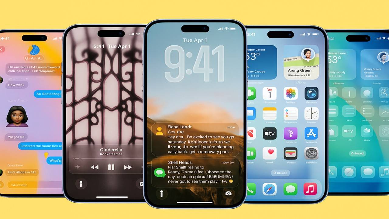
Apple’s design DNA has forever been about elegance, simplicity, and attention to detail — and with iOS 26, Apple again pushed the boundaries further in rethinking the iPhone user interface. The Liquid Glass look, introduced with iOS 26, ushered a new visual identity for Apple’s platform. Iridescent layers, nuanced transparency, and silky depth effects added a newfound realism and fluidity to the iPhone experience.
But not everyone was completely at ease with this visual change. Some users adored the futuristic, glass-like look; others felt it was too see-through and distracting. Acting quickly on feedback, Apple’s iOS 26.1 Beta 4 adds a long-awaited feature — a new switch to reduce Liquid Glass transparency.
This follows another instance of Apple carefully tuning the balance between design innovation and user comfort.
What Is Liquid Glass?
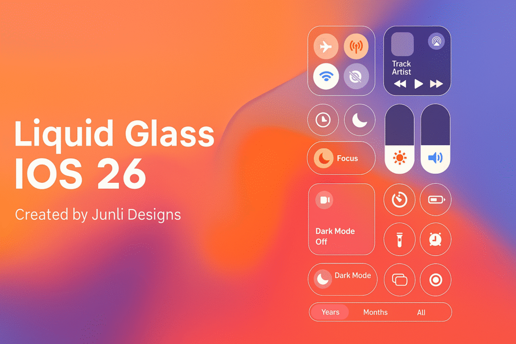
The “Liquid Glass” material is Apple’s future system design language. It’s an evolution of the blurred transparency since iOS 7’s “Frosted Glass” aesthetic, but made more dynamic and realistic in texture. The interface looks like it’s constructed of liquid glass — warping light, reflecting colors from the surrounding, and bringing the UI a feeling of physical depth.
From the Control Centre to Lock Screen notifications, Safari tabs, and even the Settings menus, the new Liquid Glass effect discreetly reveals what’s underneath every level of the interface. The upshot is an improved, visually connected system that feels alive and tactile.
Apple describes it as “delightfully fluid” — but the first adopters of iOS 26 betas discovered that the same effect occasionally had a price tag. On colorful background images or crowded home screens, the transparency would cut into text readability or make buttons more difficult to read.
The Problem: Too Much Transparency
Designers have always spoken about the need for a balance between beauty and usability, and Liquid Glass epitomizes that need.
At the time of its release with iOS 26, critics lauded its beauty but condemned excessive transparency making some UI elements hard to make out. Translucent layers were stunning on stage at Apple’s WWDC demonstrations, but in the harsh realities of everyday lighting conditions, others found them hard to look at.
Apple started subtly messing with this in iOS 26 Beta 3, adding a bit more transparency to the Dock, notification cards, and widgets. Those slight adjustments made things clearer, but users still asked for more control. And that’s precisely what iOS 26.1 Beta 4 gives.
What’s New in iOS 26.1 Beta 4
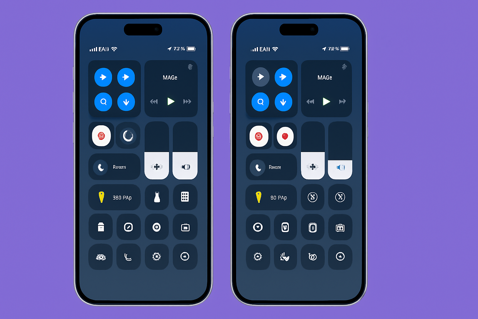
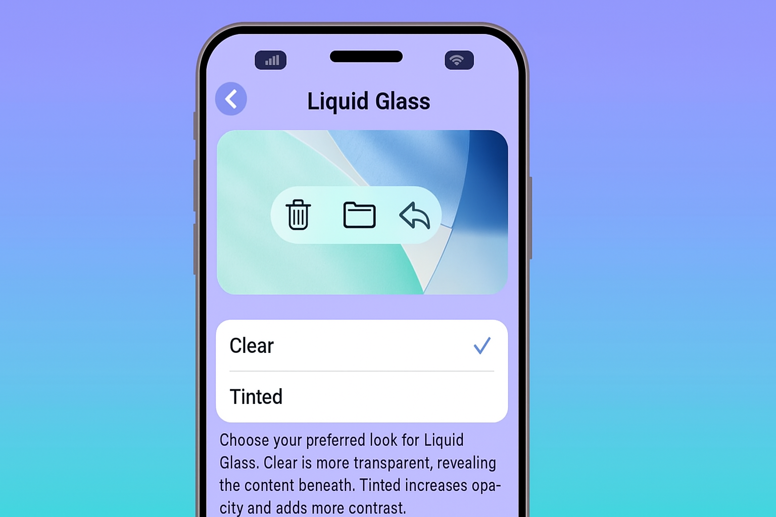
The headline feature of iOS 26.1 Beta 4 is the new toggle to reduce Liquid Glass transparency. Found in Settings → Display & Brightness → Liquid Glass, this control lets users choose how “glassy” their interface appears.
You now get two distinct options:
- Clear Mode – Retains the original, extremely transparent Liquid Glass look. This is the high-fidelity, design-led experience Apple originally had in mind when initially revealing iOS 26. Layers glimmer, backgrounds softly bleed through, and the interface comes alive.
- Tinted Mode – Scales down transparency by applying a darker, more opaque layer to system elements. It adds contrast, minimizes visual noise, and makes text and icons more apparent — ideal for readers who value readability over visual depth.
The change impacts a broad array of UI components — ranging from Control Centre tiles, Safari toolbars, and app navigation bars, to notification banners and lock screen widgets. AppleInsider and MacRumors mention, though, that certain aspects, like home screen icons and widgets, bear little resemblance when toggling Clear and Tinted.
How to Use the New Toggle
If you are signed up to Apple’s Developer or Public Beta program, you can test this feature now:
- Install iOS 26.1 Beta 4 or higher.
- Navigate to Settings → Display & Brightness → Liquid Glass.
- Select Clear or Tinted.
If the background still looks too hectic, you can also use Settings → Accessibility → Display & Text Size → Reduce Transparency to make things even more opaque.
The system will apply your selection immediately across all apps and system levels — no reboot necessary.
Why This Matters
Apple’s design philosophy has consistently been one of giving people beautiful simplicity. But “simple” is not “one-size-fits-all.” The new Liquid Glass toggle demonstrates Apple listening intently to its community and making design more inclusive and personalized.
For the general user, it translates to easier reading and ease of use — particularly for those on complex wallpaper visually or with visual sensitivities towards blur and translucency.
For developers and designers, it’s an indication that Apple’s new design language is adaptive. Apps utilizing Apple’s Material API will smoothly adjust their translucency levels to the system setting so that a uniform experience is provided whether the user likes Clear or Tinted.
In terms of accessibility, this little toggle is a giant leap forward. It provides users with more contrast control without requiring them to go deep into accessibility menus. It’s the bridge between aesthetic and accessibility — an area Apple has always been strong at.
Apple’s Rapid Design Refinement
What’s interesting in particular is how quickly Apple reacted. Liquid Glass launched only months back, and in three iterations of beta, Apple has already added fine-grained control. This follows a larger trend across Apple’s recent software launches — reacting to immediate user feedback instead of waiting through an entire major release cycle.
In iOS 26 Beta 3, Apple did make UI elements ever so slightly darker and widen background blur. Now, in Beta 4, users themselves have the choice.
It’s similar to how Apple originally added the “Reduce Motion” option after people complained about iOS 7’s parallax animations. Over time, those little quality-of-life tweaks have contributed to making iOS one of the most user-finessed mobile platforms out there.
Beyond Transparency: Other iOS 26.1 Beta 4 Changes
While the Liquid Glass control takes center stage, Beta 4 also offers a couple of other tweaks of interest:
- A new Lock Screen Camera Toggle that allows users to turn off the camera shortcut on the Lock Screen for privacy.
- Minor animations and background performance tweaks.
- Bug fixes for widgets, app crashes, and display scaling on some models.
These tiny touches, along with the new design control, make iOS 26.1 one of the more user-centric point releases in recent memory.
A Step Toward More Customizable iOS
The addition of this Liquid Glass toggle suggests something bigger — Apple’s gradual but inevitable shift towards interface customization. For years, iOS was notoriously inflexible, with very little means for users to personalize its appearance. But recent releases — from customizable lock screens to font tweaks, and now transparency controls — reveal Apple’s changed mindset.
The future of iOS could have even more refinement in terms of control over themes, tinting, or even color temperature for materials such as Liquid Glass. This is an interesting path for users who desire their devices to reflect individual taste instead of a static design norm.
Conclusion
The new Liquid Glass transparency toggle on iOS 26.1 Beta 4 is not a small UI adjustment — it’s a respectful answer to user demand, a nod to accessibility, and an indication that Apple is embracing greater personalization.
Regardless of whether you like the neon sheen of Clear mode or the equilibrated, readable color of Tinted mode, iOS 26.1 keeps you firmly in command of how your iPhone looks and feels.
Design creativity tends to tread a thin line between aesthetics and functionality. With this release, Apple again demonstrates that it’s willing to tilt that balance — not to sacrifice its vision, but to ensure each user enjoys it their way.
In a world in which visual comfort is as desirable as visual beauty, Apple’s choice to provide users with this easy option is both brilliant and beautiful — classic Apple through and through.